%%html
<style>
.jp-MarkdownCell {background-color: cornsilk;}
.text_cell {background-color: cornsilk;}
style>
 CS109A Introduction to Data Science
Standard Section 5: Logistic Regression, Multiple Logistic Regression, and kNN Classification
Harvard University
Fall 2020
Instructors: Pavlos Protopapas, Kevin Rader, and Chris Tanner
Section Leaders: Marios Mattheakis, Mike Sedelmeyer, N Ouyang
#RUN THIS CELL
import requests
from IPython.core.display import HTML
styles = requests.get(
    "https://raw.githubusercontent.com/Harvard-IACS/2018-CS109A/master/content/styles/cs109.css"
).text
HTML(styles)
Contents
In this section we will be covering Linear Regression, Logistic Regression, and kNN Classification using the Iris dataset.
Specifically, we will:
Fit a LINEAR regression model for classification, understand drawbacks, and interpret results
Consider the impact of different regularization parameters on the above polynomial model
For our breakout exercises, we will:
Standardize our data and fit a simple logistic regression model
Add an interaction term and use
LogisticRegressionCVto cross-validate a regularization parameter
By the end, we hope you will be comfortable building your own classification models.
For this section we will be using the following packages:
# Data and Stats packages
import numpy as np
import pandas as pd

from sklearn.linear_model import LinearRegression
from sklearn.metrics import accuracy_score
from sklearn.model_selection import train_test_split
from sklearn.neighbors import KNeighborsClassifier
from sklearn.preprocessing import StandardScaler

# NEW packages
from sklearn import datasets
from sklearn.linear_model import LogisticRegression
from sklearn.linear_model import LogisticRegressionCV

# Visualization packages
%matplotlib inline
import matplotlib.pyplot as plt
import seaborn as sns

import warnings
warnings.filterwarnings("ignore")
1. Import and explore data
For Section 5 we will be using datasets available directly within sklearn.
- For section examples, we will be using Fisher's famous "Iris" dataset
- For our breakout sessions, we will be using the "Wine" dataset
To learn more about sklearn datasets, please see the documentation: https://scikit-learn.org/stable/datasets/index.html
dataset = datasets.load_iris()
print(dataset.keys())
What our the target and features?
print(dataset.target_names)
print(dataset.feature_names)

# Uncomment if you want to see much, much more info on this dataset
# print(dataset['DESCR'])
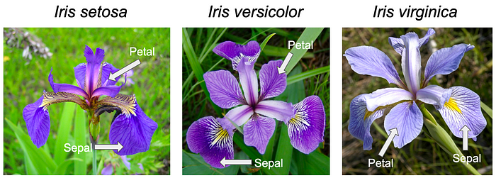
As we can see, the response variable (y) is the flower type, it has 3 classes:
- setosa
- versicolor
- virginica
These are three different species of Iris flowers.
The 4 predictor variables are flower characteristics (x):
- sepal length (cm)
- sepal width (cm)
- petal length (cm)
- petal width (cm)
Although this is a toy dataset, in real datasets it will be important to understand the underlying features. Below is a comparison of the three species and their sepals/petals, as well as the overall flower.


Images not loading? See them online:
X = pd.DataFrame(data=dataset.data, columns=dataset.feature_names)
y = pd.DataFrame(data=dataset.target, columns=['species'])
print(X.shape)
print(y.shape)
display(X.head())
display(X.describe())
display(y.head())
display(y.describe())
Explore Data
Check which variables have high correlations and distinctive patterns with the response.
Any patterns worth mentioning?
full_df = pd.concat([X,y], axis=1)
full_df.head()
sns.pairplot(full_df)
plt.show()

Are the features sepal/petal length and width uniformally distributed or do you observe some clusters of data points?
What do you expect? Let's add color according to our response variable with hue='species'.
sns.pairplot(full_df, hue='species')
plt.show()

Some features like 'petal length' and 'petal width' do have very high correlations and distinctive patterns with the response variable 'flower species'. When we would use these features for predicting the flower species, the classification wouldn't be very difficult. Certain ranges of 'petal length' and 'petal width' are very much correlated with a specific flower species and they are almost seperating our classes perfectly.
Just for illustration purposes we will continue to use only 'sepal width (cm)' and 'sepal length (cm)'. We are making the problem harder for ourselves by only using 'weaker' or less-discriminative features.
X = X[['sepal width (cm)', 'sepal length (cm)']]
Train-Test Split
X_train, X_test, y_train, y_test = train_test_split(X, y, test_size=0.33, random_state=42)
print(X_train.shape)
print(y_train.shape)

print(X_test.shape)
print(y_test.shape)
2. Fit a LINEAR regression model for classification, understand drawbacks, and interpret results
model_linear_sklearn = LinearRegression()

#Training
model_linear_sklearn.fit(X_train, y_train)

#Predict
y_pred_train = model_linear_sklearn.predict(X_train)
y_pred_test = model_linear_sklearn.predict(X_test)

#Perfromance Evaluation
train_score = accuracy_score(y_train, y_pred_train)*100
test_score = accuracy_score(y_test, y_pred_test)*100

print("Training Set Accuracy:",str(train_score)+'%')
print("Testing Set Accuracy:",str(test_score)+'%')
y_train[:5]
y_pred_train[:5]
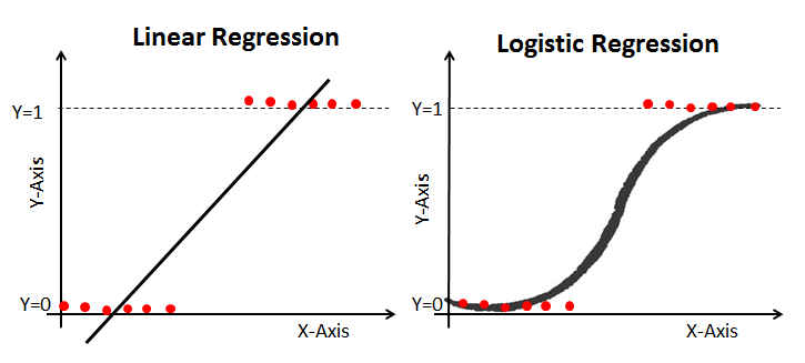
The fact that our linear regression is outputting continuous predicstions is one of the major drawbacks of linear regression for classification. We can solve this in two manners:
- Simply rounding our prediction by using
np.round()and converting it to an int data type with.astype(int)
- Or, use a modified algorithm that has bounded outputs (more about Logistic Regression later)
np.round(y_pred_train[:5])
np.round(y_pred_train[:5]).astype(int)
model_linear_sklearn = LinearRegression()

#Training
model_linear_sklearn.fit(X_train, y_train)

#Predict
y_pred_train = np.round(model_linear_sklearn.predict(X_train)).astype(int)
y_pred_test = np.round(model_linear_sklearn.predict(X_test)).astype(int)

#Perfromance Evaluation
train_score = accuracy_score(y_train, y_pred_train)*100
test_score = accuracy_score(y_test, y_pred_test)*100

print("Training Set Accuracy:",str(train_score)+'%')
print("Testing Set Accuracy:",str(test_score)+'%')
Get Performance by Class (Lookup Confusion Matrix)
- Each row of the matrix represents the instances in an actual class
- Each column represents the instances in a predicted class (or vice versa)
- The name stems from the fact that it makes it easy to see if the system is confusing two classes (i.e. commonly mislabeling one as another).
confusion_matrix_linear = pd.crosstab(
    y_test.values.flatten(),
    y_pred_test.flatten(),
    rownames=['Actual Class'],
    colnames=['Predicted Class'],
)
display(confusion_matrix_linear)
Can we use Linear Regression for classification?
Four Assumptions of Linear Regression:
- Linearity: Our dependent variable Y is a linear combination of the explanatory variables X (and the error terms)
- Observations are independent of one another
- Constant variance of the error terms (i.e. homoscedasticity)
- The error terms are normally distributed ~ $N(0,\sigma^2)$
Suppose we have a binary outcome variable. Can we use Linear Regression?
Then we will have the following problems:
- The error terms are heteroskedastic
- $\epsilon$ is not normally distributed because Y takes on only two values
- The predicted probabilities can be greater than 1 or less than 0
Datasets where linear regression is problematic:
- Binary response data where there are only two outcomes (yes/no, 0/1, etc.)
- Categorical or ordinal data of any type, where the outcome is one of a number of discrete (possibly ordered) classes
- Count data in which the outcome is restricted to non-negative integers.
- Continuous data in which the noise is not normally distributed
This is where Generalized Linear Models (GLMs), of which logistic regression is a specific type, come to the rescue!
- Logistic regression is most useful for predicting binary or multi-class responses.
3. Fit a simple LOGISTIC regression model for classification, compare performance, and interpret results
The logistic regression formula:
$$\hat{p}= \dfrac{e^{w^T x}}{1+e^{w^T x}}$$This is equivalent to:
$$\hat{p}= \dfrac{1}{1+e^{-w^T x}}$$
#Training
model_logistic = LogisticRegression(C=100).fit(X_train, y_train)

#Predict
y_pred_train = model_logistic.predict(X_train)
y_pred_test = model_logistic.predict(X_test)

#Perfromance Evaluation
train_score = accuracy_score(y_train, y_pred_train)*100
test_score = accuracy_score(y_test, y_pred_test)*100

print("Training Set Accuracy:",str(train_score)+'%')
print("Testing Set Accuracy:",str(test_score)+'%')
Let's compare logistic regression against linear regression predictions
To do this, we will hold one of our 2 predictors constant so we can easily visualize and compare our prediction curves.
We fix
X_train['sepal width (cm)']to its mean value.x_1 = X_train['sepal width (cm)']x_1_range = np.ones_like(x_2_range)*x_1.mean()
We vary
X_train['sepal length (cm)']from its minimum to its maximum and look how the predicted class evolves.x_2 = X_train['sepal length (cm)']x_2_min, x_2_max = x_2.min(), x_2.max()+0.3x_2_range = np.arange(x_2_min, x_2_max, 0.003)
# Making our input features (x_2 varying, x_1 constat = mean of x_1)
x_1 = X_train['sepal width (cm)']
x_2 = X_train['sepal length (cm)']

x_2_min, x_2_max = x_2.min()-0.1, x_2.max()+0.3

x_2_range  = np.arange(x_2_min, x_2_max, 0.003)
x_1_range  = np.ones_like(x_2_range)*x_1.mean()

# Construct our input features
X_with_varying_x_2 = np.stack(
    [x_1_range.ravel(), x_2_range.ravel()],
    axis = 1
)

# Make linear Predictions
prediction_linear = model_linear_sklearn.predict(X_with_varying_x_2)

# Make logistic Predictions
prediction_proba = model_logistic.predict_proba(X_with_varying_x_2)
prediction_thresholded = model_logistic.predict(X_with_varying_x_2)

f, axes = plt.subplots(1,2, figsize=(14,6))

# Plot Linear Predictions
axes[0].plot(
    x_2_range, prediction_linear,
    'k--',
    label= 'Linear Output (raw = continuous)'
)
axes[0].plot(
    x_2_range, np.round(prediction_linear),
    'k-',
    alpha=1,
    label= 'Linear Predicted Class (rounded = integer)',
)
axes[0].plot(
    x_2_range, np.round(prediction_thresholded),
    'r-',
    alpha=0.5,
    label= 'Logistic Predicted Class (as shown on right)',
)
axes[0].legend()
axes[0].set_title(
    'LINEAR Regression:\nRaw output and rounded output',
    fontsize=14,
)
axes[0].set_yticks([0, 1, 2, 3])
axes[0].set_ylabel('Predicted Class', fontsize=12)

# Plot Logistic Predictions
for i in sorted(set(prediction_thresholded)):
    axes[1].plot(
        x_2_range, prediction_proba[:,i],
        linewidth=2,
        label= '$\hat{{P}}\:(Y={})$'.format(i)
    )
    axes[1].fill_between(
        x_2_range[prediction_thresholded==i], 1, 0,
        alpha=0.2,
        edgecolor='gray',
    )
axes[1].legend()
axes[1].set_title(
    "LOGISTIC Regression: predicted probability\nper class and the predicted class",
    fontsize=14,
)
axes[1].set_ylabel('Predicted Probability', fontsize=12)

for ax in axes.flat:
    ax.tick_params(labelsize=12)
    ax.set_xlabel('sepal width (cm)', fontsize=12)
    ax.legend(fontsize=11, framealpha=1, edgecolor='k')

plt.tight_layout()
plt.show()

How does our Logistic Regression come up with mutiple class predictions?
- Each class $y_i$ has a sigmoid function that tries to predict the probability of the tested input belonging to that specific class $y_i$.
- In our case when we have 3 classes, thus we have 3 sigmoid functions (the blue, orange and green line in the right figure).
LogisticRegression().predict_proba(...): returns probability estimates $P(y_i|x)$ for each $y_i$. In our case.predict_proba(...)returns 3 values (one for each class). In the figure we observe that :- we have a high probability of predicting Class 0 in regions with low 'sepal width' values (left).
- we have a high probability of predicting Class 1 in regions with medium 'sepal width' regions (middle).
- have a high probability of predicting Class 2 in regions with high 'sepal width' regions (right).
LogisticRegression().predict(...): returns 1 value: the predicted class label. The class with the highest probability given by.predict_proba(...)is exactly the predicted class output of.predict(...)- In the figure our final prediction is the red line.
Get Performance by Class (Lookup Confusion Matrix)
confusion_matrix_logistic = pd.crosstab(
    y_test.values.flatten(),
    y_pred_test.flatten(),
    rownames=['Actual Class'],
    colnames=['Predicted Class'],
)
display(confusion_matrix_logistic)
Let's compare the confusion matrix of our linear model to the confusion matrix of our logistic regression model:
print('======================================')
print('Confusion Matrix Linear Regression:')
display(confusion_matrix_linear)

print('\n======================================')
print('Confusion Matrix Logistic Regression:')
display(confusion_matrix_logistic)
print('======================================')
Now we do observe that the logistic regression has the correct number of predicted classes.
Breakout Session #1
Fit and examine a multiclass logistic regression model
- Load and get to know a new dataset
- Select our predictors and response variable
- Generate a train-test-split
- Scale our data
- Perform logistic regression and investigate our results

Image source: https://en.wikipedia.org/wiki/Wine
dataset_wine = datasets.load_wine()
print(dataset_wine.keys())
print()
print(dataset_wine['DESCR'])
X_wine = pd.DataFrame(data=dataset_wine.data, columns=dataset_wine.feature_names)
y_wine = pd.DataFrame(data=dataset_wine.target, columns=['class'])
print(X_wine.shape)
print(y_wine.shape)
full_df_wine = pd.concat([X_wine, y_wine], axis=1)
full_df_wine.head()
Uncomment and run the pairplot in the cell below if you wish to see a scatter-matrix of all variables contained in the wine dataset.
Please note: This plotting code will take a minute or so to run.
# sns.pairplot(full_df_wine, hue='class')
# plt.suptitle('Wine dataset features, colored by cultivator class', fontsize=30, y=1)
# plt.show()
The wine dataset provides many variables to use in our model.
Because we have limited time for this exercise, we will pretend we have already conducted EDA on our dataset and have chosen to focus solely on the predictors
alcoholandflavanoids.Run the code below to subset our full wine dataframe and to perform our train-test-split.
predictors = ['alcohol', 'flavanoids']

full_df_wine_train, full_df_wine_test, = train_test_split(
    full_df_wine[predictors+['class']],
    test_size=0.2,
    random_state=109,
    shuffle=True,
    stratify=full_df_wine['class'],
)
- Now let's take a quick look at our training data to get a sense for how
alcoholandflavanoidsrelate to one another, as well as to our cultivatorclassresponse variable.
sns.scatterplot(
    data=full_df_wine_train,
    x='alcohol', y='flavanoids',
    hue='class',
)
plt.title(
    'Wine training observations,\ncolored by cultivator class',
    fontsize=14
)
plt.show()

What do you notice about the scale of our two predictor variables?
- It looks like the mean is shifted, but the total range of values are similar.
- Let's standardize our predictors to center our points and to ensure that both variables are commonly scaled.
- IMPORTANT: Remember to fit your scaler ONLY on your training data and to transform both train and test from that training fit. NEVER fit your scaler on the test set.
###################################
## SUBSET OUR X AND y DATAFRAMES ##
###################################

X_wine_train, y_wine_train = full_df_wine_train[predictors], full_df_wine_train['class']
X_wine_test, y_wine_test = full_df_wine_test[predictors], full_df_wine_test['class']

print(
    "Summary statistics for our training predictors BEFORE standardizing:\n\n"
    "{}\n".format(X_wine_train.describe())
)

##########################
## SCALE THE PREDICTORS ##
##########################

# Be certain to ONLY EVER fit your scaler on X train (NEVER fit it on test)
scaler = StandardScaler().fit(X_wine_train[predictors])

# Use your train-fitted scaler to transform both X train and X test
X_wine_train[predictors] = scaler.transform(X_wine_train[predictors])
X_wine_test[predictors] = scaler.transform(X_wine_test[predictors])

print(
    "Summary statistics for our training predictors AFTER standardizing:\n\n"
    "{}".format(X_wine_train.describe())
)
# Give it a shot!

model1_wine = ...
# %load '../solutions/breakout_1_sol.py'
4. Visualize Predictions and Decision boundaries
What are decision boundaries:
- In general, a pattern classifier carves up (or tesselates or partitions) the feature space into volumes called decision regions.
- All feature vectors in a decision region are assigned to the same category.
X_train.head()
def plot_points(ax):
    for i, y_class in enumerate(set(y_train.values.flatten())):
        index = (y_train == y_class).values
        ax.scatter(
            X_train[index]['sepal width (cm)'],
            X_train[index]['sepal length (cm)'],
            c=colors[i],
            marker=markers[i],
            s=65,
            edgecolor='w',
            label=names[i],
        )
f, ax = plt.subplots(1, 1, figsize=(7, 6))

colors = ["tab:blue", "tab:orange","tab:green"]
markers = ["s", "o", "D"]
names = dataset.target_names

plot_points(ax)

ax.legend(bbox_to_anchor=(1, 1), loc='upper left', ncol=1)
ax.set_title('Classes of Flowers')
ax.set_ylabel('sepal length (cm)')
ax.set_xlabel('sepal width (cm)')
plt.tight_layout()
plt.show()

Plotting the decision boundary by using the following functions:
np.meshgrid()meshgridreturns coordinate matrices from coordinate vectors, effectively constructing a grid.- The documentation: https://numpy.org/doc/stable/reference/generated/numpy.meshgrid.html
plt.contourf()contourfdraws filled contours.- The documentation: https://matplotlib.org/api/_as_gen/matplotlib.pyplot.contourf.html#matplotlib.pyplot.contourf
What is meshgrid? A quick numpy dive...
How does meshgrid work?
Creates two, 2D arrays of all the points in the grid: one for x coordinates, one for y coordinates

We will go step-by-step to create a 3-by-4 grid below:
x_vector = np.linspace(-6, 6, 3)  # start, stop, num pts
y_vector = np.linspace(-2, 1, 4)

print(f"x_vector: {x_vector} \t shape: {x_vector.shape}")
print(f"y_vector: {y_vector} \t shape: {y_vector.shape}")
# Return 2D x,y points of a grid
x_grid, y_grid = np.meshgrid(x_vector, y_vector)

print(f"x_grid, shape {x_grid.shape}:\n\n{x_grid}\n")
print(f"y_grid, shape {y_grid.shape}:\n\n{y_grid}")
Additional numpy methods you will notice used in our decision boundary plots:
np.ravel(), which returns a contiguous flattened array.np.stack(), which concatenates a sequence of arrays along a new axis.
x_grid_ravel = x_grid.ravel()
y_grid_ravel = y_grid.ravel()

print(f"x_grid.ravel(), shape {x_grid_ravel.shape}:\n\n{x_grid_ravel}\n")
print(f"y_grid.ravel(), shape {y_grid_ravel.shape}:\n\n{y_grid_ravel}")
xy_grid_stacked = np.stack(
    (x_grid.ravel(), y_grid.ravel()),
    axis=1
)

print(f"x and y stacked as columns in output:\n\n{xy_grid_stacked}\n")

xy_grid_stacked = np.stack(
    (x_grid.ravel(), y_grid.ravel()),
    axis=0
)

print(f"x and y stacked as rows in output:\n\n{xy_grid_stacked}")
Now, with our numpy review over, let's get back to plotting our boundaries!
- First, we will create a very fine (spacing of 0.003!)
np.meshgridof points to evaluate and color.
x_1 = X_train['sepal width (cm)']
x_2 = X_train['sepal length (cm)']

# Just for illustration purposes we use a margin of 0.2 to the
# left, right, top and bottum of our minimal and maximal points.
# This way our minimal and maximal points won't lie exactly
# on the axis.

x_1_min, x_1_max = x_1.min() - 0.2, x_1.max() + 0.2
x_2_min, x_2_max = x_2.min() - 0.2, x_2.max() + 0.2

xx_1, xx_2 = np.meshgrid(
    np.arange(x_1_min, x_1_max, 0.003),
    np.arange(x_2_min, x_2_max, 0.003),
)
- Then, we will generate predictions for each point in our grid and use
plt.contourfto plot those results!
# Plotting decision regions
f, ax = plt.subplots(1, 1, figsize=(7, 6))

X_mesh = np.stack((xx_1.ravel(), xx_2.ravel()),axis=1)

Z = model_logistic.predict(X_mesh)
Z = Z.reshape(xx_1.shape)

# contourf(): Takes in x,y, and z values -- all 2D arrays of same size
ax.contourf(xx_1, xx_2, Z, alpha=0.3, colors=colors, levels=2)

plot_points(ax)

ax.legend(bbox_to_anchor=(1, 1), loc='upper left', ncol=1)
ax.set_title('Classes of Flowers')
ax.set_ylabel('sepal length (cm)')
ax.set_xlabel('sepal width (cm)')

plt.tight_layout()
plt.show()

Why are the decision boundaries of this Logistic Regression linear?
Imagine the simple case where we have only a 2 class classification problem:
The logistic regression formula can be written as: $$ \hat{p} = \cfrac{e^{w^T x}}{1+e^{w^T x}} $$
Dividing through by the numerator, This is equivalent to $$ \hat{p} = \cfrac{1}{1+e^{-w^T x}} $$
Expanding $w^T x$, we have $x_1$ (sepal width), $x_2$ (sepal length), and our intercept $x_0$ (constant = 1):
$$ w^T x = \begin{bmatrix} w_0 & w_1 & w_2 \\ \end{bmatrix} \begin{bmatrix} x_0 \\ x_1 \\ x_2 \end{bmatrix} $$Which makes our formula for $\hat{p}$ equivalent to:
$$ \hat{p} = \cfrac{1}{1 +e^{\displaystyle -(w_0 \cdot 1 + w_1 \cdot x_1 + w_2 \cdot x_2)}} $$Since we don't use multiple higher order polynomial features like $x_1^2, x_2^2$, our logistic model only depends on the first order simple features $x_1$ and $x_2$.
What do we have to do to find the the decision boundary?
The decision boundaries are exactly at the position where our algorithm "hesitates" when predicting which class to classify. The output probability of our sigmoid (or softmax) is exactly 0.5. Solving our sigmoid function for $p=0.5$:
$$ \begin{split} 0.5 &= \cfrac{1}{1 +e^{\displaystyle -(w_0 \cdot 1 + w_1 x_1 + w_2 x_2)}} \\ 0.5 &= \cfrac{1}{1 + 1} \\ e^{\displaystyle -(w_0 \cdot 1 + w_1 x_1 + w_2 x_2)} &= 1 \\ & \\ -(w_0 \cdot 1 + w_1 x_1 + w_2 x_2 ) &= 0 \end{split} $$When we only use two predictor features this constraint of $p=0.5$ results in a linear system; thus we observe a linear decision boundary.
In our case when we have three classes.
5. Fit a higher order polynomial logistic regression model for classification, compare performance, plot decision boundaries, and interpret results
In this section we will create degree-2 polynomial features for both of our predictors and re-fit our model and examine the results.
X_train.head()
X_train_poly = X_train.copy()
X_train_poly['sepal width (cm)^2'] = X_train['sepal width (cm)']**2
X_train_poly['sepal length (cm)^2'] = X_train['sepal length (cm)']**2

X_test_poly = X_test.copy()
X_test_poly['sepal width (cm)^2'] = X_test_poly['sepal width (cm)']**2
X_test_poly['sepal length (cm)^2'] = X_test_poly['sepal length (cm)']**2
X_test_poly.head()
#Training
model_logistic_poly = LogisticRegression(penalty="none").fit(X_train_poly, y_train)

#Predict
y_pred_train = model_logistic_poly.predict(X_train_poly)
y_pred_test = model_logistic_poly.predict(X_test_poly)

#Perfromance Evaluation
train_score = accuracy_score(y_train, y_pred_train)*100
test_score = accuracy_score(y_test, y_pred_test)*100

print("Training Set Accuracy:",str(train_score)+'%')
print("Testing Set Accuracy:",str(test_score)+'%')
- How would you test if this is happening?
- How would you inhibit this phenomenon from happening?
# Plotting decision regions
f, ax = plt.subplots(1, 1, figsize=(6, 6))

X_mesh_poly = np.stack(
    (xx_1.ravel(), xx_2.ravel(), xx_1.ravel()**2,xx_2.ravel()**2),
    axis=1,
)

Z = model_logistic_poly.predict(X_mesh_poly)
Z = Z.reshape(xx_1.shape)

ax.contourf(xx_1, xx_2, Z, alpha=0.3, colors=colors, levels=2)

plot_points(ax)

ax.legend(bbox_to_anchor=(1, 1), loc='upper left', ncol=1)
ax.set_title('Classes of Flowers')
ax.set_ylabel('sepal length (cm)')
ax.set_xlabel('sepal width (cm)')

plt.show()

Decision boundaries for higher order logistic regression
Let's return to the mathematical representation of our logistic regression model:
$$\hat{p}= \dfrac{e^{w^T x}}{1+e^{w^T x}}$$Which is equivalent to:
$$\hat{p}= \dfrac{1}{1+e^{-w^T x}}$$Now we use $x_1$ (sepal width), $x_2$ (sepal length), an intercept $x_0$ (constant =1), PLUS two higher order terms while making predictions:
$x_1^2 = [\text{sepal width}]^2$
$x_2^2 = [\text{sepal length}]^2$
Now solving for $p=0.5$ results in an equation also dependent on $x_1^2$ and $x_2^2$: thus we observe non-linear decision boundaries:
$$ \begin{split} 0.5 &= \cfrac{1}{1 +e^{\displaystyle -(w_0 \cdot 1 + w_1 x_1 + w_2 x_2 + w_3 x_1^2 + w_4 x_2^2)}} \\ 0.5 &= \cfrac{1}{1 + 1} \\ e^{\displaystyle -(w_0 \cdot 1 + w_1 x_1 + w_2 x_2 + w_3 x_1^2 + w_4 x_2^2)} &= 1 \\ & \\ -(w_0 \cdot 1 + w_1 x_1 + w_2 x_2 + w_3 x_1^2 + w_4 x_2^2) &= 0 \end{split} $$Breakout Session #2
Plot boundaries for our prior breakout model
- In this session, we will plot decision boundaries for the
model1_winemodel we fit during Breakout Session #1.
# We give you the plotting function here
def plot_wine_2d_boundaries(X_data, y_data, predictors, model, xx_1, xx_2):
    """Plots 2-dimensional decision boundaries for a fitted sklearn model

    :param X_data: pd.DataFrame object containing your predictor variables
    :param y_data: pd.Series object containing your response variable
    :param predictors: list of predictor names corresponding with X_data columns
    :param model: sklearn fitted model object
    :param xx_1: np.array object of 2-dimensions, generated using np.meshgrid
    :param xx_2: np.array object of 2-dimensions, generated using np.meshgrid
    """

    def plot_points(ax):
        for i, y_class in enumerate(set(y_data.values.flatten())):
            index = (y_data == y_class).values
            ax.scatter(
                X_data[index][predictors[0]],
                X_data[index][predictors[1]],
                c=colors[i],
                marker=markers[i],
                s=65,
                edgecolor='w',
                label="class {}".format(i),
            )

    # Plotting decision regions
    f, ax = plt.subplots(1, 1, figsize=(7, 6))

    X_mesh = np.stack((xx_1.ravel(), xx_2.ravel()), axis=1)

    Z = model.predict(X_mesh)
    Z = Z.reshape(xx_1.shape)

    ax.contourf(xx_1, xx_2, Z, alpha=0.3, colors=colors, levels=2)

    plot_points(ax)

    ax.legend(bbox_to_anchor=(1, 1), loc='upper left', ncol=1)
    ax.set_title(
        'Wine cultivator class prediction\ndecision boundaries',
        fontsize=16
    )
    ax.set_xlabel(predictors[0], fontsize=12)
    ax.set_ylabel(predictors[1], fontsize=12)

    plt.tight_layout()
    plt.show()
## Your code here

# Give breakout 2 a try! Just adapt the iris code to the wine dataset

# Create your meshgrid arrays similar to xx_1 and xx_2
# Be certain to use reasonable min and max bounds for your data

xx_1_wine, xx_2_wine = ..., ...

# Then plot your boundaries

plot_wine_2d_boundaries( ... )
# %load '../solutions/breakout_2_sol.py'
6. Fit regularized polynomial logistic regression models and examine the results
%%time

f, ax = plt.subplots(1, 3, sharey=True, figsize=(6*3, 6))

model_logistics =[]
model_logistics_test_accs_scores =[]
model_logistics_train_accs_scores =[]

for test, C in enumerate([10000, 100, 1]):
    model_logistics.append(LogisticRegression(C=C).fit(X_train_poly, y_train))

    y_pred_train = model_logistics[test].predict(X_train_poly)
    y_pred_test = model_logistics[test].predict(X_test_poly)
    model_logistics_train_accs_scores.append(accuracy_score(y_train, y_pred_train)*100)
    model_logistics_test_accs_scores.append(accuracy_score(y_test, y_pred_test)*100)

    Z = model_logistics[test].predict(X_mesh_poly)
    Z = Z.reshape(xx_1.shape)

    ax[test].contourf(xx_1, xx_2, Z, alpha=0.3, colors=colors, levels=2)
    plot_points(ax[test])

    ax[test].set_title('Classes of Flowers, with C = '+ str(C), fontsize=16)
    ax[test].set_xlabel('sepal width (cm)', fontsize=12)

    if test==0:
        ax[test].legend(loc='upper left', ncol=1, fontsize=12)
        ax[test].set_ylabel('sepal length (cm)', fontsize=12)

plt.tight_layout()
plt.show()

What do you observe?
- How are the decision boundaries looking?
- What happens when the regularization term
Cchanges? - You may want to look at the documentation of
sklearn.linear.LogisticRegression()to see how theCargument works:
# To get the documentation uncomment and run the following command:

# LogisticRegression?
What do expect regarding the evolution of the norm of the coefficients of our models when the regularization term C changes?
Our list contains all 3 models with different values for C (take a look at the first parameter within brackets)
model_logistics
for test, model in enumerate(model_logistics):
    print('\nRegularization parameter : \tC = {}'.format(model.C))
    print("Training Set Accuracy : \t{}".format(model_logistics_train_accs_scores[test])+'%')
    print("Testing Set Accuracy : \t\t{}".format(model_logistics_test_accs_scores[test])+'%')
    print('Mean absolute coeficient : \t{:0.2f}'.format(np.mean(np.abs(model.coef_))))
Interpretation of Results: What happens when our Regularization Parameter decreases?
The amount of regularization increases, and this results in:
- The training set accuracy decreasing a little bit (not much of a problem)
- The TEST Accuracy INCREASING a little bit (better generalization!)
- The size of our coefficents DECREASES on average.
Breakout Exercise #3
Tune and fit a Lasso regularized model using cross-validation.
- Perform Lasso regularized logistic regression and choose an appropriate
Cby using cross-validation
- Confirm whether any predictors are identified as unimportant (i.e. $w_i=0$)
There are a number of different tools built into sklearn that help you to perform cross-validation.
- A lot of examples in this class so far have used
sklearn.model_selection.cross_validateas the primary means for peforming cross-validation.
- BUT WAIT!!! As it turns out,
sklearnprovides a very useful tool for performing logistic regression cross-validation across a range of regularization hyperparameters.
For this problem, you should use the sklearn.linear_model.LogisticRegressionCV.
## Your code here.
# %load '../solutions/breakout_3_sol.py'
7. kNN Classification
In this section, we will fit a kNN-classification model, plot our decision boundaries, and interpret the results.
You can read the KNeighborsClassifier documentation here: https://scikit-learn.org/stable/modules/generated/sklearn.neighbors.KNeighborsClassifier.html
#Training
model_KNN_classifier = KNeighborsClassifier(n_neighbors=1).fit(X_train, y_train)
#Predict
y_pred_train = model_KNN_classifier.predict(X_train)
y_pred_test = model_KNN_classifier.predict(X_test)

#Perfromance Evaluation
train_score = accuracy_score(y_train, y_pred_train)*100
test_score = accuracy_score(y_test, y_pred_test)*100

print("Training Set Accuracy:",str(train_score)+'%')
print("Testing Set Accuracy:",str(test_score)+'%')
The fact we have a big gap of performance between the test and training set means we are overfitting. This can be explained by our choice to use n_neighbors=1.
Please note: The below code cell will take several minutes to run, primarily because of the large number of values in our meshgrid against which each kNN model must generate predictions.
What does this tell us about the efficiency of the kNN algorithm vs. regularized logistic regression?
- Notice that the comparable set of 3 subplots generated using logistic regression only took about 1 second to run.
%%time

# Similar to what we did above for varying values C
# let's explore the effect that k in kNN classification has on our decision boundaries
ks = [1, 50, 100]

X_mesh = np.stack((xx_1.ravel(), xx_2.ravel()),axis=1)
Z = model_logistic.predict(X_mesh)
Z = Z.reshape(xx_1.shape)

f, ax = plt.subplots(1, 3, sharey=True, figsize=(6*3, 6))

model_ks = []
model_ks_test_accs_scores = []
model_ks_train_accs_scores = []

for test, k in enumerate(ks):
    model_ks.append(KNeighborsClassifier(n_neighbors=k).fit(X_train, y_train))

    y_pred_train = model_ks[test].predict(X_train)
    y_pred_test = model_ks[test].predict(X_test)
    model_ks_train_accs_scores.append(accuracy_score(y_train, y_pred_train)*100)
    model_ks_test_accs_scores.append(accuracy_score(y_test, y_pred_test)*100)

    Z = model_ks[test].predict(X_mesh)
    Z = Z.reshape(xx_1.shape)

    ax[test].contourf(xx_1, xx_2, Z, alpha=0.3, colors=colors, levels=2)
    plot_points(ax[test])

    ax[test].set_title('Classes of Flowers, with k = '+ str(k), fontsize=16)
    ax[test].set_xlabel('sepal width (cm)', fontsize=12)

    if test==0:
        ax[test].legend(loc='upper left', ncol=1, fontsize=12)
        ax[test].set_ylabel('sepal length (cm)', fontsize=12)

plt.tight_layout()
plt.show()

8. Introducing sklearn pipelines (optional)
Pipelines can be used to to sequentially apply a list of transforms (e.g. scaling, polynomial feature creation) and a final estimator.
Instead of manually building our polynomial features which might take a lot of lines of code we can use a pipeline to sequentially create polynomials before fitting our logistic regression. Scaling can also be done inside the make_pipeline.
The documentation: https://scikit-learn.org/stable/modules/generated/sklearn.pipeline.make_pipeline.html
Previously we did:
X_train_poly_cst=X_train_cst.copy()
X_train_poly_cst['sepal width (cm)^2'] = X_train_cst['sepal width (cm)']**2
X_train_poly_cst['sepal length (cm)^2'] = X_train_cst['sepal length (cm)']**2

X_test_poly_cst=X_test_cst.copy()
X_test_poly_cst['sepal width (cm)^2'] = X_test_poly_cst['sepal width (cm)']**2
X_test_poly_cst['sepal length (cm)^2'] = X_test_poly_cst['sepal length (cm)']**2
Now it is a one-liner:
make_pipeline(PolynomialFeatures(degree=2, include_bias=False), LogisticRegression())
# your code here
from sklearn.pipeline import make_pipeline
from sklearn.preprocessing import PolynomialFeatures

polynomial_logreg_estimator = make_pipeline(
    PolynomialFeatures(degree=2,include_bias=False),
    LogisticRegression(),
)

#Training
polynomial_logreg_estimator.fit(X_train_poly, y_train)

#Predict
y_pred_train = polynomial_logreg_estimator.predict(X_train_poly)
y_pred_test = polynomial_logreg_estimator.predict(X_test_poly)

#Perfromance Evaluation
train_score = accuracy_score(y_train, y_pred_train)*100
test_score = accuracy_score(y_test, y_pred_test)*100

print("Training Set Accuracy:",str(train_score)+'%')
print("Testing Set Accuracy:",str(test_score)+'%')