Key Word(s): Decision Trees, Classification
Instructions:
We are trying to predict the winner of the 2016 Presidential election (Trump vs. Clinton) in each county in the US. To do this, we will consider several predictors including minority: the percentage of residents that are minorities and bachelor: the percentage of resident adults with a bachelor's degree (or higher). We will perform the following tasks
Read and explore the data set
- Fit, visualize, and interpret a tree with 1 predictor
- Fit, visualize, and interpret a tree with 2 predictors
- Fit, visualize, interpret, and CV a best
max_depthfor a tree with many predictors
Hints:
sklearn.DecisionTreeClassifier() : Generates a Logistic Regression classifier
sklearn.score() : Accuracy classification score.
matplotlib.contourf() : Accuracy classification score
Note: This exercise is auto-graded and you can try multiple attempts.
import numpy as np
import pandas as pd
import sklearn as sk
import matplotlib.pyplot as plt
import seaborn as sns

from sklearn.tree import DecisionTreeClassifier
from sklearn import tree

from sklearn.model_selection import cross_val_score

pd.set_option('display.width', 100)
pd.set_option('display.max_columns', 20)
plt.rcParams["figure.figsize"] = (12,8)
Part 0: Reading and Exploring the data
We will be using the county_election dataset (provided separately as train and test versions for you) to model the outcome of the 2016 presidential election (Did Trump or Clinton win each county?) from various predictors.
We start by reading in the datasets for you and visualizing the main predictors for now: minority:
Important note: use the training dataset for all exploratory analysis and model fitting. Only use the test dataset to evaluate and compare models.
elect_train = pd.read_csv("data/county_election_train.csv")
elect_test = pd.read_csv("data/county_election_test.csv")
elect_train.head()
# let's create the response variable and summarize it

y_train = 1*(elect_train['trump']>elect_train['clinton'])
y_test = 1*(elect_test['trump']>elect_test['clinton'])

print("The proportion of counties that favored Trump over Clinton in 2016 was:",'%.4g' % np.mean(y_train) )
Let's look at the main predictor's distribution via boxplots: and consider what the log-transformed version of it looks like:
fig, (ax1,ax2) = plt.subplots(1,2, figsize=[15,6])

ax1.boxplot([elect_train.loc[y_train==0]['minority'],
             elect_train.loc[y_train==1]['minority']],
             labels=("Clinton","Trump"))
ax1.set_ylabel("Proportion of residents that are minorities")

ax2.boxplot([np.log(elect_train.loc[y_train==0]['minority']),
             np.log(elect_train.loc[y_train==1]['minority'])],
             labels=("Clinton","Trump"))
ax2.set_ylabel("Proportion of residents that are minorities")
plt.show()
Q0.1 How would you describe the distribution of the variable minority? What issues does this create in logistic regression, $k$-NN, and Decision Trees? How can these issues be fixed? Which of the two versions of 'minority' would be a better choice to use as a predictor for inference? For prediction?
your answer here
Part 1: Decision Trees
We could use a simple Decision Tree regressor to predict votergap. That's not the aim of this lab, so we'll run a few of these models without any cross-validation or 'regularization' just to illustrate what is going on.
This is what you ought to keep in mind about decision trees.
from the docs:
max_depth : int or None, optional (default=None)
The maximum depth of the tree. If None, then nodes are expanded until all leaves are pure or until all leaves contain less than min_samples_split samples.
min_samples_split : int, float, optional (default=2)- The deeper the tree, the more prone you are to overfitting.
- The smaller
min_samples_split, the more the overfitting. One may usemin_samples_leafinstead. More samples per leaf, the higher the bias (aka, simpler, underfit model).
Below we fit 2 decision treees that limit the max_depth: a single split, and one with depth of 3 (resulting in 8 leaves).
elect_train['logminority'] = np.log(elect_train['minority'])
elect_test['logminority'] = np.log(elect_test['minority'])

dummy_x = np.arange(np.min(elect_train['minority']),np.max(elect_train['minority']),0.01)

plt.plot(elect_train['minority'],y_train,'.')

for i in [1,3]:
    dtree = DecisionTreeClassifier(max_depth=i)
    dtree.fit(elect_train[['minority']],y_train)
    plt.plot(dummy_x , dtree.predict(dummy_x.reshape(-1,1)), label=("Classifications,  max depth ="+str(i)), alpha=0.5, lw=4)
    plt.plot(dummy_x , dtree.predict_proba(dummy_x.reshape(-1,1))[:,1], label=("Probabilities, max depth ="+str(i)), alpha=0.5, lw=2)

plt.legend();
And the actual decision tree can be printed out using sklearn.tree.plot_tree:
from sklearn import tree

plt.figure(figsize=(16,8))
tree.plot_tree(dtree, filled=True)
plt.show()
Q1.1 Interpret the printed out tree above: how does it match the scatterplot visualization of the tree?
your answer here
Q1.2 Play around with the various arguments to define the complexity of the decision tree: max_depth,min_samples_split, and min_samples_leaf (do 1 at a time for now, you can use multiple of these arguments). Roughly, at what point do these start to overfit?
plt.plot(elect_train['minority'],y_train,'.')

for i in [1,30,100]:
    dtree = DecisionTreeClassifier(min_samples_leaf=i)
    dtree.fit(elect_train[['minority']],y_train)
    plt.plot(dummy_x , dtree.predict(dummy_x.reshape(-1,1)), label=("min leaf size ="+str(i)), alpha=0.8, lw=4)

plt.legend();
tree.plot_tree(dtree, filled=True)
plt.show()
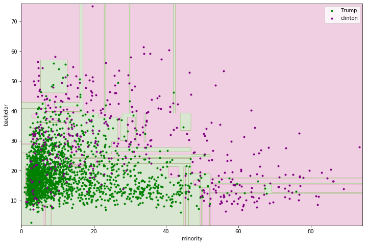
Let's take this to the 2-dimensional feature/predictor set: also include bachelor" the proportion of residents with at least a bachelor's degree. Let's start by visualizing the data:
plt.scatter(elect_train['minority'][y_train==1], elect_train['bachelor'][y_train==1],marker=".",color="green",label="Trump")
plt.scatter(elect_train['minority'][y_train==0], elect_train['bachelor'][y_train==0],marker=".",color="purple",label="Clinton")
plt.xlabel("minority")
plt.ylabel("bachelor")
plt.legend()
plt.show()
Q1.3 Based on the scatterplot above, does there appear to be good separability between the two classes? If you were to create a single box around the points to separate the 2 classes, where would you draw the box (a decision tree with max_depth=2?
your answer here
Q1.4 Create two decision tree classifiers below: one with max_depth=2 and one with max_depth=10?
### edTest(test_dtrees) ###

dtree2 = ___
dtree10 = ___
Let's plot the decision boundaries for these two trees (code provided for you below).
x1_min, x1_max = elect_train['minority'].min() - 1, elect_train['minority'].max() + 1
x2_min, x2_max = elect_train['bachelor'].min() - 1, elect_train['bachelor'].max() + 1
x1x, x2x = np.meshgrid(np.arange(x1_min, x1_max, 0.1),
                     np.arange(x2_min, x2_max, 0.1))

yhat2 = dtree2.predict(np.c_[x1x.ravel(), x2x.ravel()]).reshape(x1x.shape)
yhat10 = dtree10.predict(np.c_[x1x.ravel(), x2x.ravel()]).reshape(x1x.shape)


fig, (ax1,ax2) = plt.subplots(1,2, figsize=[15,6])

ax1.contourf(x1x, x2x, yhat2, alpha=0.2,cmap="PiYG");
ax1.scatter(elect_train['minority'][y_train==1], elect_train['bachelor'][y_train==1],marker=".",color="green",label="Trump")
ax1.scatter(elect_train['minority'][y_train==0], elect_train['bachelor'][y_train==0],marker=".",color="purple",label="Clinton")

ax1.set_xlabel("minority")
ax1.set_ylabel("bachelor")
ax1.set_title("Decision Tree with max_depth=2")
ax1.legend()

ax2.contourf(x1x, x2x, yhat10, alpha=0.2,cmap="PiYG");
ax2.scatter(elect_train['minority'][y_train==1], elect_train['bachelor'][y_train==1],marker=".",color="green",label="Trump")
ax2.scatter(elect_train['minority'][y_train==0], elect_train['bachelor'][y_train==0],marker=".",color="purple",label="Clinton")

ax2.set_xlabel("minority")
ax2.set_ylabel("bachelor")
ax2.set_title("Decision Tree with max_depth=10")
ax2.legend()
plt.show()
Q1.4 How do these trees compare? Is there clear over or under fitting for either of these tree?
*your answer here*
Q1.5 A larger X_train feature set is defined below with 8 predictors. Fit a decision tree with max_depth = 15 to this feature set and calculate the accuracy score on both the train and test sets.
### edTest(test_dtree15) ###

X_train = elect_train[['minority', 'density','hispanic','obesity','female','income','bachelor','inactivity']]
X_test = elect_test[['minority', 'density','hispanic','obesity','female','income','bachelor','inactivity']]

dtree15 = ___

dtree15_train_acc = ___
dtree15_test_acc = ___
print("Train accuracy =", float('%.4g' % dtree15_train_acc),"\n Test accuracy =",float('%.4g' % dtree15_test_acc))
Two plots are provided for you below to aid in interpreting this model (well, you have to fix the second one):
The
feature_importances_the measures the total improvement (reduction) of the cost/loss/criterion every time that feature defines a split. Note: the default iscriterion='gini.A "predicted probability plot" to get a very rough idea as to what the model is saying about how the chances of a county voting for Trump in 2016 were related to
minority.
pd.Series(dtree15.feature_importances_,index=list(X_train)).sort_values().plot(kind="barh");
Q1.6 Fix the spaghetti plot below so that it is at least a little interpretable.
### edTest(test_spaghetti) ###

###Fix this spaghetti plot! Use `np.argsort`

phat15 = dtree15.predict_proba(X_train)[:,1]
order = ___

minority_sorted = ___
phat15_sorted = ___


plt.scatter(X_train['minority'],y_train)
plt.plot(minority_sorted,phat15_sorted,alpha=0.5)
plt.show()
Q1.7 Perform 5-fold cross-validation to determine what the best max_depth would be for a single regression tree using the entire X_train feature set defined below. Visualize the results with mean +/- 2 sd's across the validation sets. Interpret the result.
np.random.seed(109)

depths = list(range(1, 21))
train_scores = []
cvmeans = []
cvstds = []
cv_scores = []
for depth in depths:
    dtree = DecisionTreeClassifier(max_depth=___)
    # Perform 5-fold cross validation and store results
    train_scores.append(dtree.fit(___,___).score(___,___))
    scores = cross_val_score(estimator=___, X=___, y=___, cv=___)
    cvmeans.append(scores.mean())
    cvstds.append(scores.std())

cvmeans = np.array(cvmeans)
cvstds = np.array(cvstds)
# plot means and shade the 2*SD interval
plt.plot(depths, cvmeans, '*-', label="Mean CV")
plt.fill_between(depths, cvmeans - 2*cvstds, cvmeans + 2*cvstds, alpha=0.3)
ylim = plt.ylim()
plt.plot(depths, train_scores, '-+', label="Train")
plt.legend()
plt.ylabel("Accuracy")
plt.xlabel("Max Depth")
plt.xticks(depths);
you answer here