Key Word(s): Logistic Regression, Classification, kNN
Instructions:
- We are trying to predict who will have AHD based on Age and MaxHAR. To do so we need to:
- Read the
Heart.csvas a data frame and split into train and test. - Assign the predictor and response variables.
- Fit logistic regression models and interpret results
- Compute the accuracy of the model.
- Plot the classification boundaries against the two predictors
- Fit an untuned regularized logistic regression model and compare the classification boundary
Hints:
sklearn.LogisticRegression() : Generates a Logistic Regression classifier
sklearn.fit() : Fits the model to the given data
sklearn.predict() : Predict using the estimated model (Logistic or knn classifiers) to perform pure classification predictions
sklearn.predict_proba() : Predict using the estimated model (Logistic or knn classifiers) to perform probability predictions of all the classes in the response (they should add up to 1 for each observation)
sklearn.LogisticRegression.coef_ and .intercept_ : Pull off the estimated $\beta$ coefficients in a Logistic Regression model
sklearn.score() : Accuracy classification score.
sklearn.accuracy_score() : Accuracy classification score
matplotlib.pcolormesh() : Accuracy classification score
Note: This exercise is auto-graded and you can try multiple attempts.
import pandas as pd
import numpy as np
import sklearn as sk
import matplotlib.pyplot as plt
%matplotlib inline

from sklearn.model_selection import train_test_split
from sklearn.linear_model import LogisticRegression
from sklearn.preprocessing import PolynomialFeatures
heart = pd.read_csv('Heart.csv')

# Force the response into a binary indicator:
heart['AHD'] = 1*(heart['AHD'] == "Yes")

print(heart.shape)
#heart.head()
heart.describe()
heart_train, heart_test = train_test_split(heart, test_size=0.3, random_state = 109)
Q1.1 Below we fit an unregularized logistic regression model (logit1) to predict AHD from Age and MaxHR in the training set (with penalty='none'). Print out the coefficient estimates, and interpret general trends.
degree = 1
predictors = ['Age','MaxHR']

X_train1 = PolynomialFeatures(degree=degree,include_bias=False).fit_transform(heart_train[predictors])
y_train = heart_train['AHD']


logit1 = LogisticRegression(penalty='none', max_iter = 5000).fit(X_train1, y_train)

print("Logistic Regression Estimated Betas:",
      logit1.___,logit1.___)
your interpretation here
Q1.1 Fit an unregularized 4th order polynomial (with interactions) logistic regression model (logit4) to predict AHD from Age and MaxHR in the training set (with penalty='none'). Print out the coefficient estimates.
### edTest(test_logit4) ###

degree = ___
predictors = ['Age','MaxHR']

X_train4 = PolynomialFeatures(degree=degree,include_bias=False).fit_transform(___)

logit4 = LogisticRegression(penalty='none', max_iter = 5000).fit(___)

print("Logistic Regression Estimated Betas:",
      logit4.___,logit4.___)
Q1.2 Evaluate the models based on misclassification rate in both the test set.
### edTest(test_misclass) ###

######
# your code here
######

predictors = ['Age','MaxHR']
X_test1 = PolynomialFeatures(degree=1,include_bias=False).fit_transform(heart_test[predictors])
X_test4 = PolynomialFeatures(degree=4,include_bias=False).fit_transform(heart_test[predictors])
y_test = heart_test['AHD']

# use logit.score()
misclass_logit1 = ___
misclass_logit4 = ___

print("Overall misclassification rate in test for logit1:",misclass_logit1)
print("Overall misclassification rate in test for logit4:",misclass_logit4)
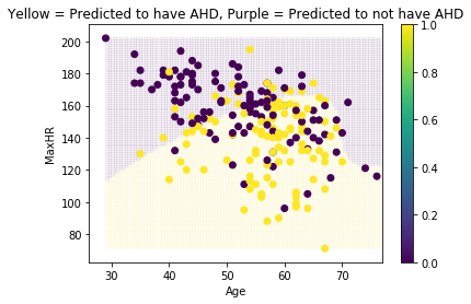
The code below performs the classification predictions for the model at all values in the range of the two predictors for logit1. Then the predictions and the train dataset are added to a scatterplot in the second code chunk:
n = 100

x1=np.linspace(np.min(heart[['Age']]),np.max(heart[['Age']]),n)
x2=np.linspace(np.min(heart[['MaxHR']]),np.max(heart[['MaxHR']]),n)
x1v, x2v = np.meshgrid(x1, x2)

# This is how we would typically do the prediction (have a vector of yhats)
#yhat10 = knn10.predict(np.array([x1v.flatten(),x2v.flatten()]).reshape(-1,2))

# To do the predictions and keep the yhats on 2-D (to match the dummy predictor shapes), use this
X = np.c_[x1v.ravel(), x2v.ravel()]
X_dummy = PolynomialFeatures(degree=1,include_bias=False).fit_transform(X)


yhat1 = logit1.predict(X_dummy)
plt.pcolormesh(x1v, x2v, yhat1.reshape(x1v.shape),alpha = 0.05)
plt.scatter(heart_train['Age'],heart_train['MaxHR'],c=heart_train['AHD'])
plt.ylabel("MaxHR")
plt.xlabel("Age")
plt.title("Yellow = Predicted to have AHD, Purple = Predicted to not have AHD")
plt.colorbar()
plt.show()
#Perform the same calculation above, but for the 4th order polynomial

X_dummy = PolynomialFeatures(degree=4,include_bias=False).fit_transform(X)
yhat4 = logit4.predict(___)

plt.pcolormesh(x1v, x2v, yhat4.reshape(x1v.shape),alpha = 0.05)
plt.scatter(heart_train['Age'],heart_train['MaxHR'],c=heart_train['AHD'])
plt.ylabel("MaxHR")
plt.xlabel("Age")
plt.title("Yellow = Predicted to have AHD, Purple = Predicted to not have AHD")
plt.colorbar()
plt.show()
Q1.3 Compare the two models above on how they create the classification boundary. Which is more likely to be overfit? How would regularization affect these boundaries?
your answer here
Q1.4 Fit a ridge-like Logistic Regression model with C=0.0001 on the 4th order polynomial as before. Compare this regularized model with the unregularized one by using the classification boundary.
### edTest(test_ridge) ###

logit_ridge = LogisticRegression(___, max_iter = 5000).fit(___, ___)
#yhat_ridge = logit_ridge.predict_proba(X_dummy)[:,1]
yhat_ridge = ___

plt.pcolormesh(x1v, x2v, yhat_ridge.reshape(x1v.shape),alpha = 0.05)
plt.scatter(heart_train['Age'],heart_train['MaxHR'],c=heart_train['AHD'])
plt.ylabel("MaxHR")
plt.xlabel("Age")
plt.title("Yellow = Predicted to have AHD, Purple = Predicted to not have AHD")
plt.colorbar()
plt.show()
your answer here