Key Word(s): regularization, bias/variance trade-off, lasso, ridge
Instructions:
- Read the file noisypopulation.csv as a pandas dataframe.
- Assign the response and predictor variables appropriately.
- Perform bootstrap operation on the dataset.
- For each bootstrap:
- For degree of the chosen degree value:
- Compute the polynomial features
- Fit the model on the given data
- Select a set of random points in the data to predict the model
- Store the predicted values as a list
- For degree of the chosen degree value:
- Plot the predicted values along with the random data points and true function as given above.
Hints:
sklearn.PolynomialFeatures() : Generates polynomial and interaction features
sklearn.LinearRegression() : LinearRegression fits a linear model
sklearn.fit() : Fits the linear model to the training data
sklearn.predict() : Predict using the linear model.
Note: This exercise is auto-graded and you can try multiple attempts.
In [1]:
#Importing libraries
%matplotlib inline
import numpy as np
import scipy as sp
import matplotlib as mpl
import matplotlib.cm as cm
import matplotlib.pyplot as plt
import pandas as pd
from sklearn.linear_model import LinearRegression
from sklearn.preprocessing import PolynomialFeatures
In [2]:
#Helper function to set plot characteristics

def make_plot():
    fig, axes=plt.subplots(figsize=(20,8), nrows=1, ncols=2);
    axes[0].set_ylabel("$p_R$", fontsize=18)
    axes[0].set_xlabel("$x$", fontsize=18)
    axes[1].set_xlabel("$x$", fontsize=18)
    axes[1].set_yticklabels([])
    axes[0].set_ylim([0,1])
    axes[1].set_ylim([0,1])
    axes[0].set_xlim([0,1])
    axes[1].set_xlim([0,1])
    plt.tight_layout();
    return axes
In [3]:
# Reading the file into a dataframe

df = pd.read_csv("noisypopulation.csv")
df.head()
Out[3]:
In [34]:
### edTest(test_data) ###

# Set the predictor and response variable
# Column x is the predictor and column y is the response variable.
# Column f is the true function of the given data
# Select the values of the columns

x = df.___
y = df.___
f = df.___
In [36]:
### edTest(test_poly) ###
# Function to compute the Polynomial Features for the data x for the given degree d
def polyshape(d, x):
    return PolynomialFeatures(___).fit_transform(___.reshape(-1,1))
In [37]:
### edTest(test_linear) ###
#Function to fit a Linear Regression model
def make_predict_with_model(x, y, x_pred):

    #Create a Linear Regression model with fit_intercept as False
    lreg = ___

    #Fit the model to the data x and y
    lreg.fit(___, ___)

    #Predict on the x_pred data
    y_pred = lreg.predict(___)
    return lreg, y_pred
In [38]:
#Function to perform bootstrap and fit the data

# degree is the maximum degree of the model
# num_boot is the number of bootstraps
# size is the number of random points selected from the data for each bootstrap
# x is the predictor variable
# y is the response variable

def gen(degree, num_boot, size, x, y):

    #Create 2 lists to store the prediction and model
    predicted_values, linear_models =[], []

    #Run the loop for the number of bootstrap value
    for i in range(num_boot):

        #Helper code to call the make_predict_with_model function to fit the data
        indexes=np.sort(np.random.choice(x.shape[0], size=size, replace=False))

        #lreg and y_pred hold the model and predicted values of the current bootstrap
        lreg, y_pred = make_predict_with_model(polyshape(degree, x[indexes]), y[indexes], polyshape(degree, x))

        #Append the model and predicted values into the appropriate lists
        predicted_values.append(___)
        linear_models.append(___)

    #Return the 2 lists
    return predicted_values, linear_models
In [39]:
### edTest(test_gen) ###
# Call the function gen twice with x and y as the predictor and response variable respectively
# The number of bootstraps should be 200 and the number of samples from the dataset should be 30
# Store the return values in appropriate variables

# Get results for degree 1
predicted_1, model_1 = gen(___);

# Get results for degree 100
predicted_100, model_100 = gen(___);
In [ ]:
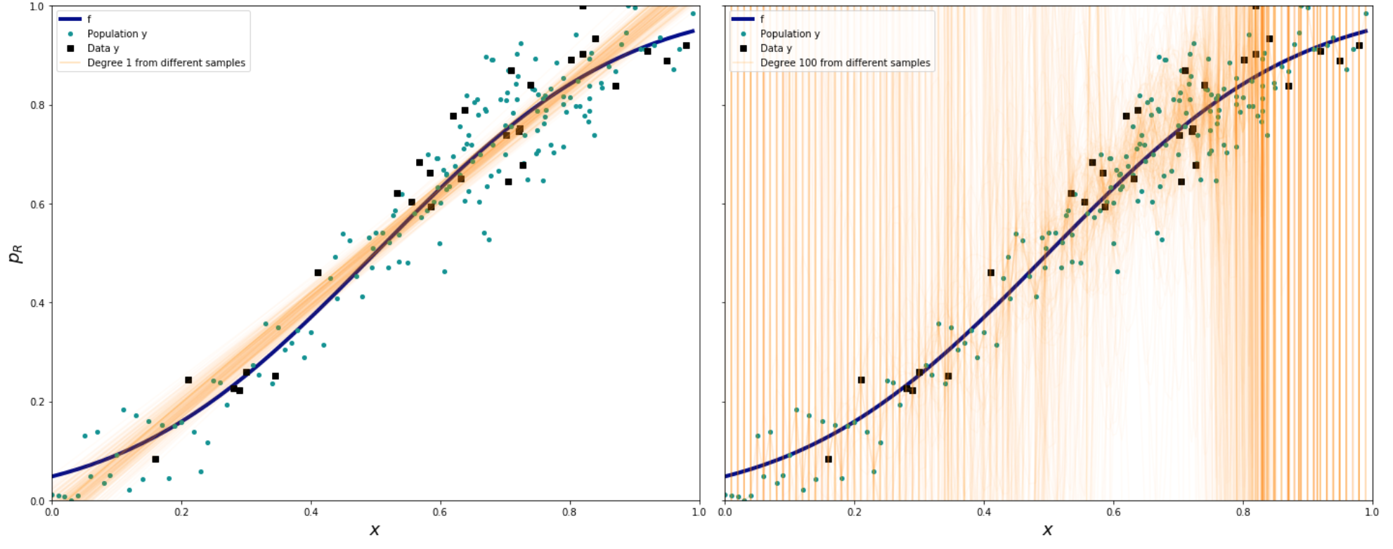
#Helper code to plot the data

indexes=np.sort(np.random.choice(x.shape[0], size=30, replace=False))

plt.figure(figsize = (12,8))
axes=make_plot()

#Plot for Degree 1
axes[0].plot(x,f,label="f", color='darkblue',linewidth=4)
axes[0].plot(x, y, '.', label="Population y", color='#009193',markersize=8)
axes[0].plot(x[indexes], y[indexes], 's', color='black', label="Data y")

for i,p in enumerate(predicted_1[:-1]):
    axes[0].plot(x,p,alpha=0.03,color='#FF9300')
axes[0].plot(x, predicted_1[-1], alpha=0.3,color='#FF9300',label="Degree 1 from different samples")


#Plot for Degree 100
axes[1].plot(x,f,label="f", color='darkblue',linewidth=4)
axes[1].plot(x, y, '.', label="Population y", color='#009193',markersize=8)
axes[1].plot(x[indexes], y[indexes], 's', color='black', label="Data y")


for i,p in enumerate(predicted_100[:-1]):
    axes[1].plot(x,p,alpha=0.03,color='#FF9300')
axes[1].plot(x,predicted_100[-1],alpha=0.2,color='#FF9300',label="Degree 100 from different samples")

axes[0].legend(loc='best')
axes[1].legend(loc='best')

#edgecolor='black', linewidth=3, facecolor='green',
plt.show()
After you mark the exercise, run the code again, but this time with degree 10 instead of 100. Do you see a decrease in variance? Why are the edges still so erractic?
Your answer here
Also check the values of the coefficients for each of your runs. Do you see a pattern?
Your answer here