Key Word(s): Logistic Regression, PCA
Classification and PCA Lab
$$ \renewcommand{\like}{{\cal L}} \renewcommand{\loglike}{{\ell}} \renewcommand{\err}{{\cal E}} \renewcommand{\dat}{{\cal D}} \renewcommand{\hyp}{{\cal H}} \renewcommand{\Ex}[2]{E_{#1}[#2]} \renewcommand{\x}{{\mathbf x}} \renewcommand{\v}[1]{{\mathbf #1}} $$
%matplotlib inline
import numpy as np
import scipy as sp
import matplotlib as mpl
import matplotlib.cm as cm
import matplotlib.pyplot as plt
import pandas as pd
pd.set_option('display.width', 500)
pd.set_option('display.max_columns', 100)
pd.set_option('display.notebook_repr_html', True)
import seaborn.apionly as sns
sns.set_style("whitegrid")
#from PIL import Image
Setting up some code
In doing homework so far you have probably seen strange behaviours when you run and rerun code. This happens in the jupyter notebook because one is generally using global variables, and you might change a value 10 cells down and then rerun a cell 10 cells before.
To work around such behavior. encapsulate code withon functions and minimize your use of global variables!
c0=sns.color_palette()[0]
c1=sns.color_palette()[1]
c2=sns.color_palette()[2]
A function to plot the points on the training and test set, and the prediction regions associated with a classifier that has 2 features. Adapted from scikit-learn examples.
from matplotlib.colors import ListedColormap
cmap_light = ListedColormap(['#FFAAAA', '#AAFFAA', '#AAAAFF'])
cmap_bold = ListedColormap(['#FF0000', '#00FF00', '#0000FF'])
cm = plt.cm.RdBu
cm_bright = ListedColormap(['#FF0000', '#0000FF'])

def points_plot(ax, Xtr, Xte, ytr, yte, clf, mesh=True, colorscale=cmap_light, cdiscrete=cmap_bold, alpha=0.1, psize=10, zfunc=False, predicted=False):
    h = .02
    X=np.concatenate((Xtr, Xte))
    x_min, x_max = X[:, 0].min() - .5, X[:, 0].max() + .5
    y_min, y_max = X[:, 1].min() - .5, X[:, 1].max() + .5
    xx, yy = np.meshgrid(np.linspace(x_min, x_max, 100),
                         np.linspace(y_min, y_max, 100))

    #plt.figure(figsize=(10,6))
    if zfunc:
        p0 = clf.predict_proba(np.c_[xx.ravel(), yy.ravel()])[:, 0]
        p1 = clf.predict_proba(np.c_[xx.ravel(), yy.ravel()])[:, 1]
        Z=zfunc(p0, p1)
    else:
        Z = clf.predict(np.c_[xx.ravel(), yy.ravel()])
    ZZ = Z.reshape(xx.shape)
    if mesh:
        plt.pcolormesh(xx, yy, ZZ, cmap=cmap_light, alpha=alpha, axes=ax)
    if predicted:
        showtr = clf.predict(Xtr)
        showte = clf.predict(Xte)
    else:
        showtr = ytr
        showte = yte
    ax.scatter(Xtr[:, 0], Xtr[:, 1], c=showtr-1, cmap=cmap_bold, s=psize, alpha=alpha,edgecolor="k")
    # and testing points
    ax.scatter(Xte[:, 0], Xte[:, 1], c=showte-1, cmap=cmap_bold, alpha=alpha, marker="s", s=psize+10)
    ax.set_xlim(xx.min(), xx.max())
    ax.set_ylim(yy.min(), yy.max())
    return ax,xx,yy
A function to add contours to such a plot. I use it while showing predictions as opposed to the default "actual test values" in points_plot.
def points_plot_prob(ax, Xtr, Xte, ytr, yte, clf, colorscale=cmap_light, cdiscrete=cmap_bold, ccolor=cm, psize=10, alpha=0.1):
    ax,xx,yy = points_plot(ax, Xtr, Xte, ytr, yte, clf, mesh=False, colorscale=colorscale, cdiscrete=cdiscrete, psize=psize, alpha=alpha, predicted=True)
    Z = clf.predict_proba(np.c_[xx.ravel(), yy.ravel()])[:, 1]
    Z = Z.reshape(xx.shape)
    plt.contourf(xx, yy, Z, cmap=ccolor, alpha=.2, axes=ax)
    cs2 = plt.contour(xx, yy, Z, cmap=ccolor, alpha=.6, axes=ax)
    plt.clabel(cs2, fmt = '%5.4f', colors = 'k', fontsize=14, axes=ax)
    return ax
Digits dataset: constructing a classification dataset
This problem is adapted from Jake Vanderpls's tutorial at pydata: (http://nbviewer.jupyter.org/github/jakevdp/sklearn_pydata2015/blob/master/notebooks/02.2-Basic-Principles.ipynb)
The classification problem there is a multiway digit classification problem
from sklearn import datasets
digits = datasets.load_digits()
digits.images.shape
print(digits.DESCR)
This code, taken from Jake's notebook above, plots the images against the targets so that we can see what we are dealing with.
fig, axes = plt.subplots(10, 10, figsize=(8, 8))
fig.subplots_adjust(hspace=0.1, wspace=0.1)

for i, ax in enumerate(axes.flat):
    ax.imshow(digits.images[i], cmap='binary', interpolation='nearest')
    ax.text(0.05, 0.05, str(digits.target[i]),
            transform=ax.transAxes, color='green')
    ax.set_xticks([])
    ax.set_yticks([])
d2d = digits.images.reshape(1797,64,)
d2d[0].shape, d2d.shape
df = pd.DataFrame(d2d)
df['target'] = digits.target
df.head()
df.groupby('target').count()
YOUR CODE HERE: To create a stripped down problem for this lab, let us take 2 numbers and try and distinguish them between images. Lets take 8 and 9. make a dtaframe called
dftwofor this
# your code here
dftwo.shape
Logistic Regression
from sklearn.linear_model import LogisticRegression
from sklearn.model_selection import train_test_split
itrain, itest = train_test_split(range(dftwo.shape[0]), train_size=0.6)
set1={}
set1['Xtrain'] = dftwo[list(range(64))].iloc[itrain, :]
set1['Xtest'] = dftwo[list(range(64))].iloc[itest, :]
set1['ytrain'] = dftwo.target.iloc[itrain]==8
set1['ytest'] = dftwo.target.iloc[itest]==8
YOUR TURN HERE: Carry out an unregularized logistic regression and calculate the score on the
set1test set.
# your code here
Logistic Regression using Cross Validation and Regularization
A function to grid search on parameters while doing cross-validation. Note we return the grid-search meta estimator. Be default GridSearchCV will refit on the entire training set. Note the use of scoring, which will allow for a use of a different scoring function on the cross-validation set than the loss used to train the model on the training set. (Kevin talked about this in class...and the default in sklearn is to use the 1-0 loss for scoring on the validation sets, and the log-loss for example in LogisticRegression, for training and parameter estimation.
I keel these separate in my head as estimation and decision losses. After all, classification requires you to make a decision as to what threshold you will choose.
from sklearn.model_selection import GridSearchCV
def cv_optimize(clf, parameters, Xtrain, ytrain, n_folds=5, scoring=None):
    if not scoring:
        gs = GridSearchCV(clf, param_grid=parameters, cv=n_folds)
    else:
        gs = GridSearchCV(clf, param_grid=parameters, cv=n_folds, scoring=scoring)
    gs.fit(Xtrain, ytrain)
    print("BEST PARAMS", gs.best_params_)
    return gs
do_classify is an omnibus function which will take a dataframe, a set of column names to use as features, a name for the target, and do the entire machine learning process for you. For the reason of comparing classifiers, it can take an existing testing and training set as well. If you ask it to, it will standardize as well.
This was what I had earlier and refactored. What more could you do?
So we refactor:
def classify_with_sets(clf, parameters, sets, n_folds = 5, scoring=None):
    Xtrain, Xtest, ytrain, ytest = sets['Xtrain'], sets['Xtest'], sets['ytrain'], sets['ytest']
    gs = cv_optimize(clf, parameters, Xtrain, ytrain, n_folds=n_folds, scoring=scoring)
    training_score = gs.score(Xtrain, ytrain)
    test_score = gs.score(Xtest, ytest)
    print("Score on training data: %0.2f" % (training_score))
    print("Score on test data:     %0.2f" % (test_score))
    return gs
def classify_from_dataframe(clf, parameters, indf, featurenames, targetname, target1val, n_folds=5, standardize=False, train_size=0.6, scoring=None):
    subdf=indf[featurenames]
    y=(indf[targetname].values==target1val)*1
    itrain, itest = train_test_split(range(subdf.shape[0]), train_size=train_size)
    inset = {}
    if standardize:
        Xtr = (subdf.iloc[itrain] - subdf.iloc[itrain].mean())/subdf.iloc[itrain].std()
        inset['Xtrain'] = Xtr.values
        Xte = (subdf.iloc[itest] - subdf.iloc[itest].mean())/subdf.iloc[itest].std()
        inset['Xtest'] = Xte.values
    else:
        inset['Xtrain'] = subdf.iloc[itrain].values
        inset['Xtest'] = subdf.iloc[itest].values
    inset['ytrain'] = y[itrain]
    inset['ytest'] = y[itest]
    clf = classify_with_sets(clf, parameters, inset, n_folds=n_folds, scoring=scoring)
    return clf, inset['Xtrain'], inset['ytrain'], inset['Xtest'], inset['ytest']
cvals = [1e-20, 1e-15, 1e-10, 1e-5, 1e-3, 1e-1, 1, 10, 100, 10000, 100000]
digitstwo_log_set1 = classify_with_sets(
    LogisticRegression(),
    {"C": cvals},
    set1,
n_folds=5)
The confusion matrix: comparing classifiers
We have written two classifiers. A classifier will get some samples right, and some wrong. Generally we see which ones it gets right and which ones it gets wrong on the test set. There,
- the samples that are +ive and the classifier predicts as +ive are called True Positives (TP)
- the samples that are -ive and the classifier predicts (wrongly) as +ive are called False Positives (FP)
- the samples that are -ive and the classifier predicts as -ive are called True Negatives (TN)
- the samples that are +ive and the classifier predicts as -ive are called False Negatives (FN)
A classifier produces a confusion matrix from these which lookslike this:
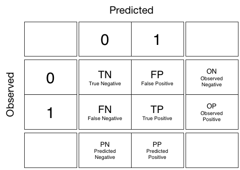
IMPORTANT NOTE: In sklearn, to obtain the confusion matrix in the form above, always have the observed y first, i.e.: use as confusion_matrix(y_true, y_pred)
from sklearn.metrics import confusion_matrix
confusion_matrix(set1['ytest'], clf.predict(set1['Xtest']))
YOUR TURN NOW: Calculate the confusion matrix for the regularized logistic regression
confusion_matrix(set1['ytest'], digitstwo_log_set1.predict(set1['Xtest']))
YOUR TURN NOW: As an exercise to do this completely with a new train/test split done directly on a dataframe. Call your classifier/estimator
digitstwo_logand your training/test sets dictionary asset2. Compute the confusion matrix for thisset2
# your code here
confusion_matrix(set2['ytest'], digitstwo_log_set2.predict(set2['Xtest']))
From the department of not-kosher things to do, (why?) we calculate the performance of this classifier on set1.
confusion_matrix(set1['ytest'], digitstwo_log_set2.predict(set1['Xtest']))
Plotting scores against hyper-parameters
Finally plot_scores takes the output of a grid search on one parameter, and plots for you a graph showing the test performance against the parameter. You could augment this with a training set diagram if you like.
def plot_scores(fitmodel, pname):
    params = [d[pname] for d in fitmodel.cv_results_['params']]
    scores = fitmodel.cv_results_['mean_test_score']
    stds = fitmodel.cv_results_['std_test_score']
    plt.plot(params, scores,'.-');
    plt.fill_between(params, scores - stds, scores + stds, alpha=0.3);
plot_scores(digitstwo_log_set2, 'C')
plt.xscale('log')
plt.ylim(0.6,1)
plot_scores(digitstwo_log_set1, 'C')
plt.xscale('log')
plt.ylim(0.6,1)
Feature engineering
Our images here are relatively small, but in general you will have as many features as pizels multiplied by the color channels. This is a lot of features! Having too many features can lead to overfitting.
Indeed, it is possible to have more features than data points. Thus there is a high chance that a few attributes will correlate with $y$ purely coincidentally! [^Having lots of images, or "big-data" helps in combatting overfitting!]
We need to do something similar to what happened in the regularized regression or classification here! We will engage in some a-priori feature selection that will reduce the dimensionality of the problem. The idea we'll use here is something called Principal Components Analysis, or PCA.
PCA is an unsupervized learning technique. The basic idea behind PCA is to rotate the co-ordinate axes of the feature space. We first find the direction in which the data varies the most. We set up one co-ordinate axes along this direction, which is called the first principal component. We then look for a perpendicular direction in which the data varies the second most. This is the second principal component. The diagram illustrates this process. There are as many principal components as the feature dimension: all we have done is a rotation.
(diagram taken from http://stats.stackexchange.com/questions/2691/making-sense-of-principal-component-analysis-eigenvectors-eigenvalues which also has nice discussions)
How does this then achieve feature selection? We decide on a threshold of variation; once the variation in a particular direction falls below a certain number, we get rid of all the co-ordinate axes after that principal component. For example, if the variation falls below 10% after the third axes, and we decide that 10% is an acceptable cutoff, we remove all dimensions from the fourth dimension onwards. In other words, we took our higher dimensional problem and projected it onto a 3 dimensional subspace.
These two ideas illustrate one of the most important reasons that learning is even feasible: we believe that most datasets, in either their unsupervized form $\{\v{x\}}$, or their supervized form $\{y, \v{x}\}$, live on a lower dimensional subspace. If we can find this subspace, we can then hope to find a method which respectively separates or fits the data.
from sklearn.decomposition import PCA
The explained variance ratio pca.explained_variance_ratio_ tells us how much of the variation in the features is explained by these 60 features. When we sum it up over the features, we see that 94% is explained: good enough to go down to a 60 dimensional space from a 136452 dimensional one!
We can see the individual variances as we increase the dimensionality:
The first dimension accounts for 35% of the variation, the second 6%, and it goes steadily down from there.
Let us create a dataframe with these 16 features labelled pc1,pc2...,pc60 and the labels of the sample:
Lets see what these principal components look like:
def normit(a):
    a=(a - a.min())/(a.max() -a.min())
    a=a*256
    return np.round(a)
def getNC(pc, j):
    size=8*8
    g=pc.components_[j][0:size]
    g=normit(g)
    return g
def display_component(pc, j):
    g = getNC(pc,j)
    print(g.shape)
    plt.imshow(g.reshape(8,8))
    plt.xticks([])
    plt.yticks([])
You might be a bit confused: we needed to use 16 components to explain 90% of the variation in the features, but only 1 or 2 components to separate checks from dollars? This is because PCA is unsupervised: the only variation we are explaining is the variation in the 64 dimensional feature space. We are not explaining the variation in the $y$ or the label, and it might turn out, as it does in this case, that with the additional information in $y$, the dimensionality needed for classification is much lower.
We could thus choose just the first few principal components to make our classifier. For the purposes of this lab, since two components can be easily visualized (even though adding some more features may leads to better separability), we'll go with learning a 2-dimensional classifier in the pc1 and pc2 dimensions!
pca_digits = PCA(n_components=16)
X2 = pca_digits.fit_transform(dftwo[list(range(64))].values)
X2
print(pca_digits.explained_variance_ratio_.sum())
100*pca_digits.explained_variance_ratio_
display_component(pca_digits, 0)
display_component(pca_digits, 1)
display_component(pca_digits, 2)
dfpca = pd.DataFrame({"target":dftwo.target})
for i in range(pca_digits.explained_variance_ratio_.shape[0]):
    dfpca["pc%i" % (i+1)] = X2[:,i]
dfpca.head()
colors = [c0, c2]
for label, color in zip(dfpca['target'].unique(), colors):
    mask = dfpca['target']==label
    plt.scatter(dfpca[mask]['pc1'], dfpca[mask]['pc2'], c=color, label=label, alpha=0.5)
plt.legend()
YOUR CODE NOW: Do a regularized Logistic Regression using the first two principal components. Store the classifier in
digitspca_log2and the sets insetf
# your code here
We use points plot to see misclassification and the decision boundary:
plt.figure()
ax=plt.gca()
points_plot(ax, setf['Xtrain'], setf['Xtest'], setf['ytrain'], setf['ytest'], digitspca_log2, alpha=0.5, psize=20);
And a probability contour plot to see probabilities
plt.figure()
ax=plt.gca()
points_plot_prob(ax,  setf['Xtrain'], setf['Xtest'], setf['ytrain'], setf['ytest'], digitspca_log2, alpha=0.5, psize=20);
And a scores plot to see the hyper-parameter landscape.
plot_scores(digitspca_log2, 'C')
plt.xscale('log')
And a confusion matrix...
from sklearn.metrics import confusion_matrix
confusion_matrix(setf['ytest'], digitspca_log2.predict(setf['Xtest']), )